Web Design Archive · 07 / 14
Locksmith Campaign Site
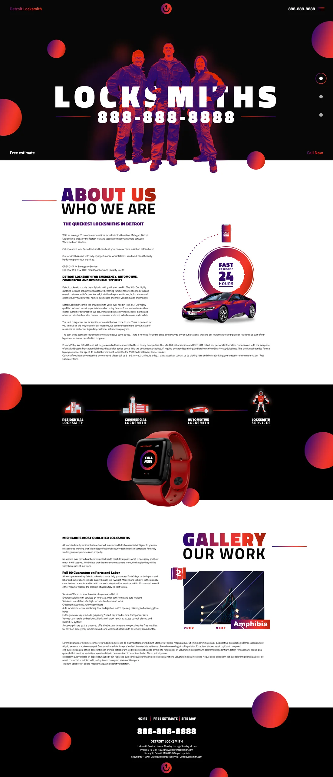
A playful high-contrast direction that uses oversized type and a campaign-like visual language for a local service brand.
Project notes
A complete page, not just a polished opening screen.
Bold red, violet and black create recognition while a conventional information structure keeps the experience usable.
The page demonstrates how an expressive art direction can carry through service, gallery and contact content.
Need the wider picture?