Brand Systems · 01 / 09
Bronx Digital Identity
A strong New York-influenced identity designed to make a local locksmith brand feel stable, direct and recognizably urban.
Project notes
A visual idea designed to remain useful as it expands.
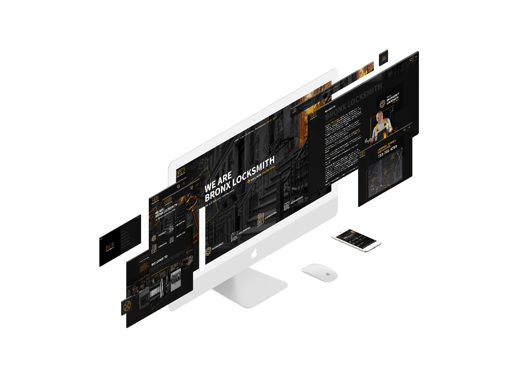
The original Wix case study describes a New York-style color direction and a logo combining a lively condensed typeface with a modern finish.
The identity extends into a responsive website, allowing the same typographic confidence and black-and-gold palette to work across real content.
Need the wider picture?